- cross-posted to:
- technology@lemmy.world
- cross-posted to:
- technology@lemmy.world
Hey everyone. I made a casual survey to see if people can tell the difference between human-made and AI generated art. Any responses would be appreciated, I’m curious to see how accurately people can tell the difference (especially those familiar with AI image generation)
Got 9/20.
That was a good selection of images, quite tricky.
I’m proud of getting both the LEGO minifig ones correct.
Another 9/20er here. I did feel like I was guessing a lot, it was almost satisfying to get such a midway score.
I also got 9/20, feeling certain about only a handful, and completely thrown off by others. Since all questions were yes/no, expected score would be 10/20, so my score correctly reflects that I had no real idea what was AI-generated or not. I expect the average score to be close to 10/20, skewed somewhat higher by those who might have a keen eye for some telltale signs of AI-trickery.
The one that got me was definitely the fruits, I didn’t realize that AI was able to generate decent text yet lol
DALL-E 3 is the only model that gets text right. It usually yields consistent results but can still jumble on words if you ask it to say too much. It’s a big step forward regardless.
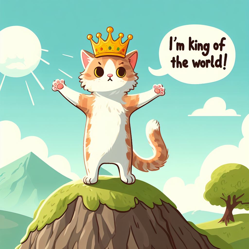
That’s incredible. I’m usually surprised when there’s a single correct word.
I take issue with this because the devil is usually in the details with ai images and these are all low rez jpgs making it harder to tell with some of these.
Unfortunately it seems like google forms resizes the image to fit the forms. If I had known this before I would’ve used something else, but oh well. I’ve stretched the images as far as they can go now, which seems to be around 740x740.
True, but low rez web jpegs is a huge part of the market for images. AI will replace stock photos and that’s incredibly disruptive on it’s own.
Right? Are hands visible? Because those are a bear to get right
Well I got less than 50%, maybe I’m an AI. What is even real anymore!?
3/20. I almost got everything perfectly backwards!
10/20, got tricked by the horse in one of them, it looked really messed up, like something AI would make.
I guess the artist cant make horses
That artist also forgot reins. And the front wheels of the carriage are goofy. And the city is a bunch of squiggles. And there’s a bizarre oversaturated smear of farmland in the distance. It’s the sort of human drawing that makes people go ‘did AI draw this?’ because a year ago they would’ve just said ‘this kinda sucks.’
The psychedelic waterfall one has the opposite problem, where the tree at left immediately had me go ‘that’s a robot,’ but it is also how humans draw when they’ve done quite a lot of drugs. Anywhere besides a landscape it would be inexcusable. But there’s every reason you might want to draw a tree, that way. An anime character eating ramen - not so much.
10/20 but I’m a little annoyed that what looks exactly like a panel from Berserk is apparently AI generated… Feels like the training data might just be replicated in entirety there, either that or someone asked it to generate “Guts from Berserk” 😛
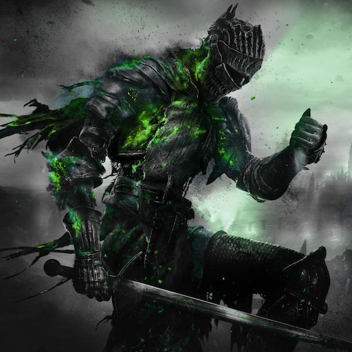
You can always notice AI based on the random belts on armor clad figures. It’s a neat belt, but why did it begin and end at the center of their chest?
12/20, most of my mistakes were in saying human-made work was AI generated.
Some of these seem unfair because - if they’re real images, they’re images that resemble common errors, and if they’re generated, they’re examples of those errors being situational enough to look ambiguous. I can tell you what I’m looking at in each image. I can tell you where I’ve seen that misplaced or overused in a ton of generated images. But I can also tell you what humans tend to scribble out that might’ve been picked up by machines without me noticing, and I can explain some that-looks-suspect locations as mundane physical artifacts.
You could argue that’s the point - demonstrating how far the technology has come in basically one year. But there’s some cases where damn near anything is plausible, so long as it’s locally sensible. Any close-up of a face might be from the “this person does not exist” kind of network, because with eight billion people on Earth, yeah, I’ll believe that’s a guy. But if you show me three pictures of the same alleged guy, I’m gonna know whether it’s a real dude or a machine hallucination. Nature photos are similarly hard because nature’s kinda anything-goes. Drawings, even moreso. There’s not much difference between an AI going nuts on waterfalls because it has poor segmentation and a human who wanted to draw a clusterfuck of waterfalls.
Here’s what I’m looking at in each image. Her thumb’s too good behind the glass, even if her fingernails are a little weird and the bench seat’s not quite the same color on either side. His glasses are the only thing that’s a little off, especially the gray-looking hairs on only his right temple, even though both could be perspective. His everything’s too smooth; if this isn’t generated then someone airbrushed a photo to death. Sketchy lines going nowhere and multiple approximations of a shape had me assume human over computer, but the bench’s third leg and janked-up shadow point to a computer or a shitty artist. This guy looks filtered instead of drawn, but it might just be scratched instead of drawn, and honestly his wonky hold on the book is less concerning than the other image’s bench. Perspective’s all fucked-up and I’m unsure why the mouse is in a bucket, but the most computery parts are the fine detail in distant waves and up-close spray, because the high frequency doesn’t match the drawing style. Except the next image has detailed asymmetrical elements and some smoke in front that only makes sense locally so I assumed these were human / generated pairs and marked the boat one as more-likely human. Fine stripey detail and repetition are suspect, as mentioned, make enough sense in this context that the distant foliage is almost more concerning. Rough painting originally had me mark this as human, versus the previous image, but where fine details appear (e.g. bottom left corner) they don’t make any sense for a human to have focused on. Either a person did a shit job drawing those horses and really scribbled out a city, or this is exactly the sort of disordered localized detail some models add. (Honestly the scale birds and bottom-left white scribble are the only things that look like ‘sloppy human’ versus ‘sloppy computer.’) God rays on craggy waterfalls are the hardest call because humans might also draw this geological uncertainty; I marked it as generated because the smaller fall to the right finishes plausibly but starts from nowhere. Soft glow forest mountains are a generated cliche at this point. Monotonic crisp layers are not. Only the English text and rounded speech-bubble tail are tells at this point. An ice cream cat seems like the kind of dumb shit you’d ask an AI to do, but this is a tough call: there’s three different kinds of “strawberry” here and they’re not bungled together, but the pay and cookie placement seem bizarre in light of the rim of the fish-cone, and the placement of the beads is either cause for criticism of a human artist or shockingly flexible for a network. Lego image one could go either way. But Lego image two has cliche composition, an impossibly detailed plastic scarf, and asymmetric nonsense prints on her legs. Cat one is painted with consistent brushstrokes on everything but the whiskers. Cat two is either a painting filter or a person drawing badly from a photo reference. Cat three is the same warm-glow cliche that’s easy to do on a computer, and if a human did that with actual paint, bravo.
11/20.
Everything photographic, I nailed. You picked some some lackluster human art.
I got real life ones correct, almost all paintings too (10 was tricky) but charcoal drawings are kinda impossible to guess.
Cool test, thanks for putting this together! I got 8/20 - this essentially proved to me that for many cases, AI generation is not really distinguishable anymore.
10/20
same score here
Detail plays a huge role in determining AI, and many of the pictures appear compressed which makes that criterion… difficult to consider. I’m not surprised that I got half right, regardless. The man on the bench really got me, why is his ankle thread-thin?
I got all the “real life” pictures correct, but most of the drawings and paintings were in line with straight guessing.
There are things that stick out as “wrong” on a picture of life, but in a drawing or paining the question is “is this wrong or just what the artist decided to do?”
12/20, these new systems are way too good at what they do. With drawings it’s basically impossible to tell unless there are obvious mistakes. And the mugshots are spot on too.


