deleted by creator

Username checks out
subscribed
By all means, go right ahead.
It better be a real tattoo, or we’ll know!
Here is an alternative Piped link(s):
https://www.piped.video/watch?v=yq3sowmrLu4
Piped is a privacy-respecting open-source alternative frontend to YouTube.
I’m open-source; check me out at GitHub.
ATBGE
It’s not great execution though
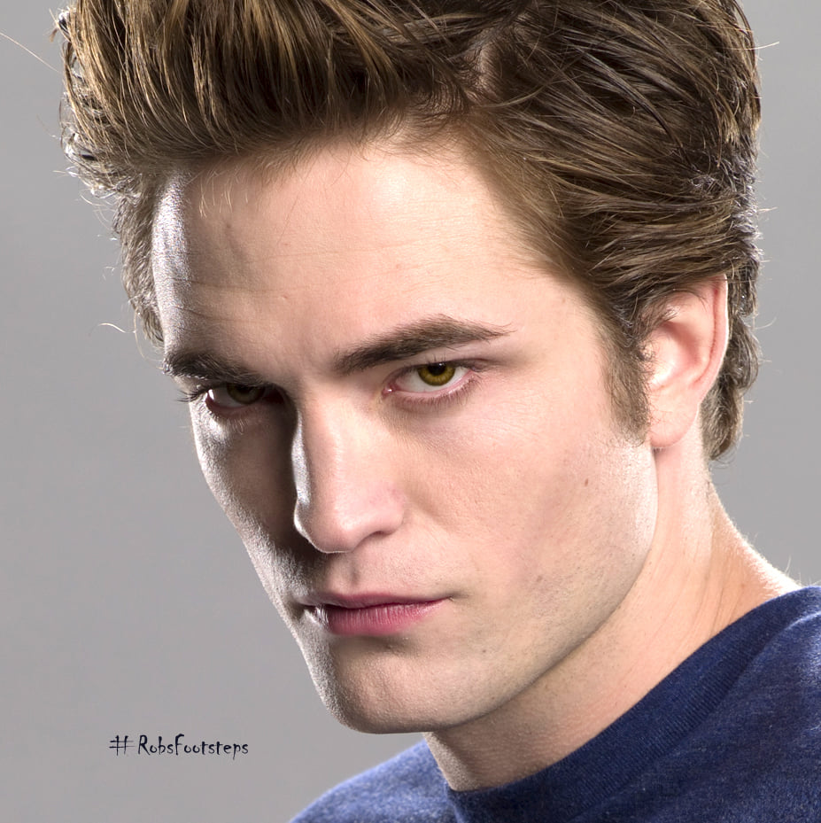
What don’t you like about the execution? Genuinely curious. I’m impressed at how they managed to convey “sparkly”
The sparkle is great but the nose looks dirty and the face flat
That’s fair. It is an odd choice to only have shadow under the nose.
ATB-ok-E?
It’s at least a well done tattoo. It has good concise line work and good shading and color. The question is, did they draw it or did the person getting it? It’s a pop art interpretation and not a portrait but a portrait and an intentional joke tattoo don’t always mix.
Actually I kinda agree, that’s kind of awesome in a terrible, ironic way (and making fun of Twilight is timeless). Flashy disco Zoolander is a killer, y’all!
Sure, but irony kind of dies when you permanently affix it to your skin. So it’s terrible, but great because the sparkly dead fish face along with the awful line and sparkle emphasis, but then loops back around to “oh my God why” because it’s a goddamn tattoo.
The only viable possibilities I see are that this is a twilight fan that thinks it goes hard unironically, or a twilight hater that really needs a different hobby.
It does go hard unironically. It’s clean, the sparkles come across immediately, even the text is surprisingly consistent given the font choice. Honestly, the only big gripe I have is some inconsistent line width in the hair, but I had to look for it.
If it was done to be funny, they nailed it. If it was done in earnest by a fan, fucken equally cool. It’s genuinely not a bad tattoo IMO.
The tattoo is excellent, but to permanently have it on your skin is a level of irony poisoning I aspire to have one day.
An upside of apocalyptic environmental collapse due by the end of the century is The Elders™ trying to explain their very specific joke tattoos to the younglings.
I mean, it’s not r/terriblelifedecisions (even if that really should be). In any case, I’ve seen worse tattoos as jokes. Not everyone has good judgement when it comes to permanent things.
If the person finds it funny and it’s done well, why not?
I personally find the “eat pant” Bart cake to be so goddamn funny I can’t breathe basically any time I see it, so getting a well done tattoo of that for me would be great forever
It’s important to remember that redditors do not stand by anything they say. So it doesn’t matter.
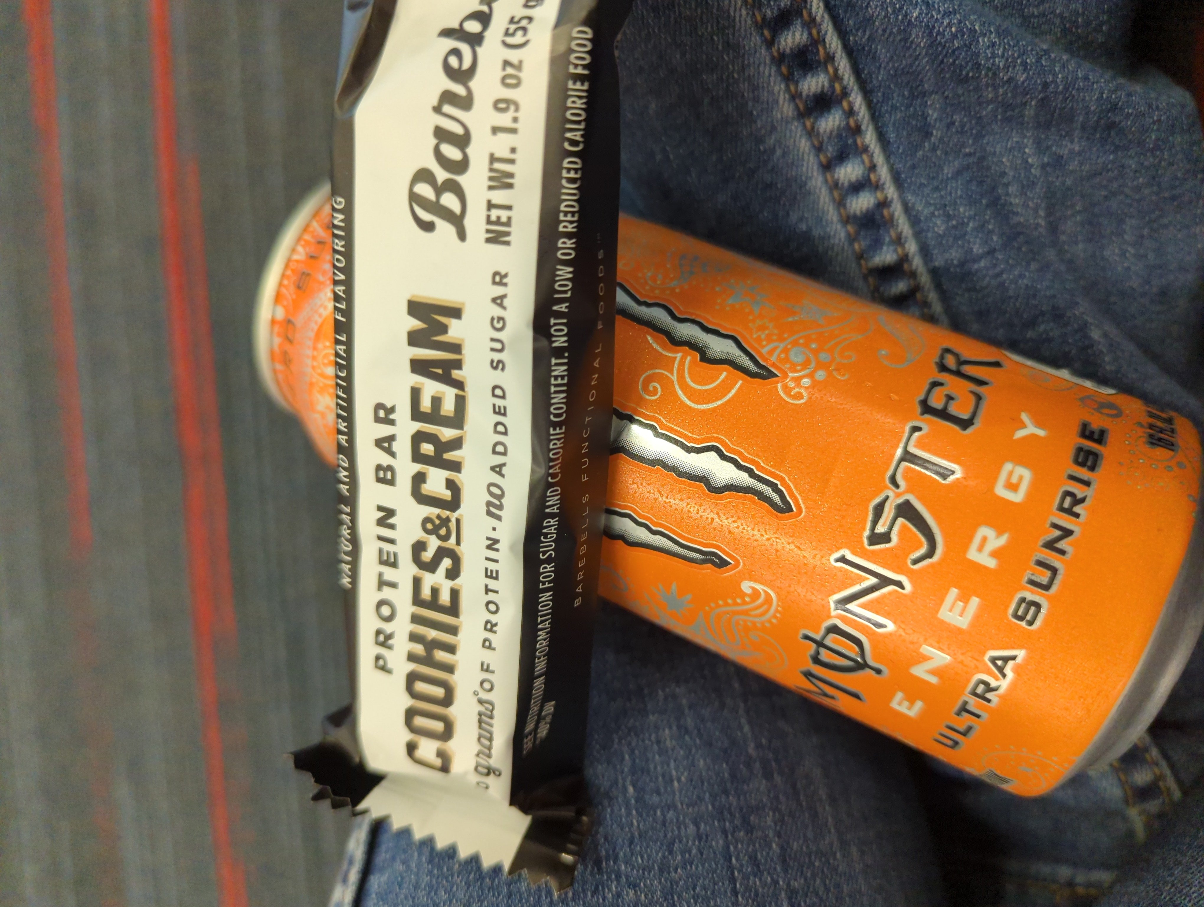
Is that a Slurm can tat in the background?
Sure looks like it
I see they’re a man of culture as well.
I can kind of see why. I don’t understand why anybody would ever get this as a tattoo, but it’s actually well drawn, it’s not “shitty” per se, maybe more tacky I guess.
Back on Reddit you had /r/atbge, awful taste, but good execution.
This one might rank quite high in that category
atbge, awful taste, but good execution
Oh, so that is what it means. I used to skip posts in this sub because of the cryptic name.
deleted by creator
Idk looks more like mold is taking over his face
deleted by creator
Rule 5 of the sub says: “Shitty tattoo. Either in taste or concept or execution.”
I would argue it’s in poor taste, as it’s basically a shitpost on your body.
Stop caring what Reddit thinks
No u
I can’t tell what body part this is supposed to be
obviously it’s the skin, smh.
Ah yes, so silly of me
Looks kind of like a lemon.
TITSOAK BABY
Isn’t Titsoak getting banned in the US? /s
Does /r/shittytattoos think this is good? I mean, I suppose it is well done. More /r/ATBGE material.
Yes, a lot of the comments were saying it was a great tattoo and didn’t fot the sub
Honestly, while I would never get this tattoo and might look a little sideways at it if I saw it while out and about, its actually very well done and looks really clean. I think there was a sub called like awful content but excellent execution or something like that it would better suited for.
I believe it was awful taste but great execution and yeah this is prime content for it
Dude has a deer nose and that font is fucked.
So did they lose a bet?
Glitter, like Twilight.
The quality isn’t bad, the nose is maybe strangely small, lips are a little off-putting, the lettering could be neater.
But yeah “ew Twilight bad.”
the nose is maybe strangely small, lips are a little off-putting
Well, I mean… It’s not THAT far off, is it?


I mean, the face is terrible. Whoever designed this should try looking at faces to see what they look like.


